
LIGHTBORNE
Investigating the elements of the intricate relationship between humans and nature by employing botanical macro photography, reduction, and abstraction, I have explored the fundamental yet often overlooked characteristics of flowers. Across two distinct series, I consider the aesthetic qualities of colour and structure and the nuanced responses and impacts these can elicit.
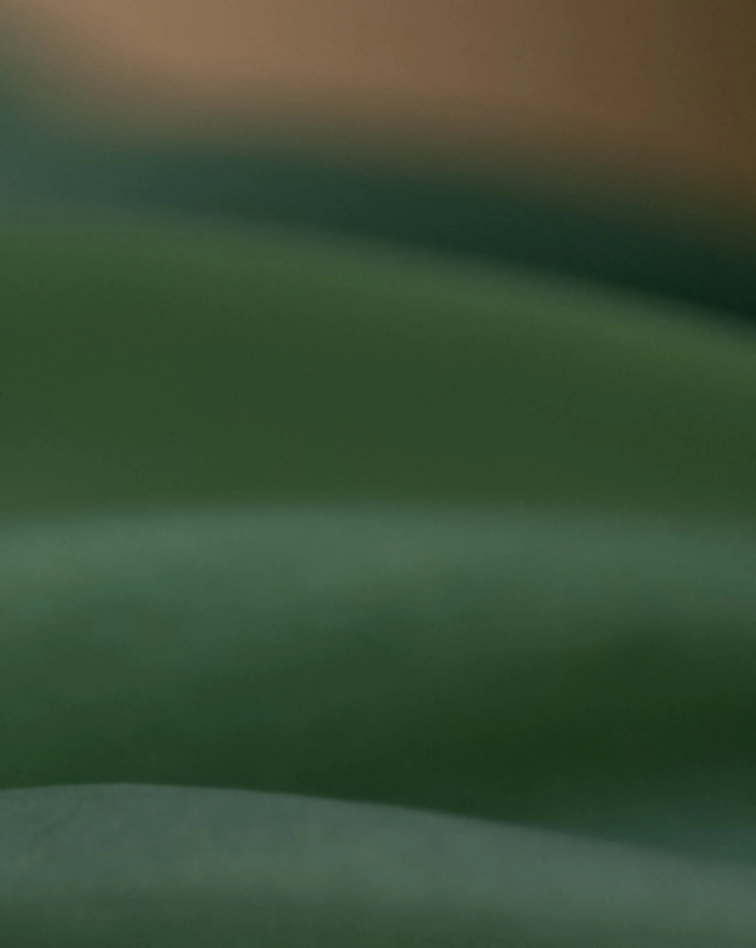
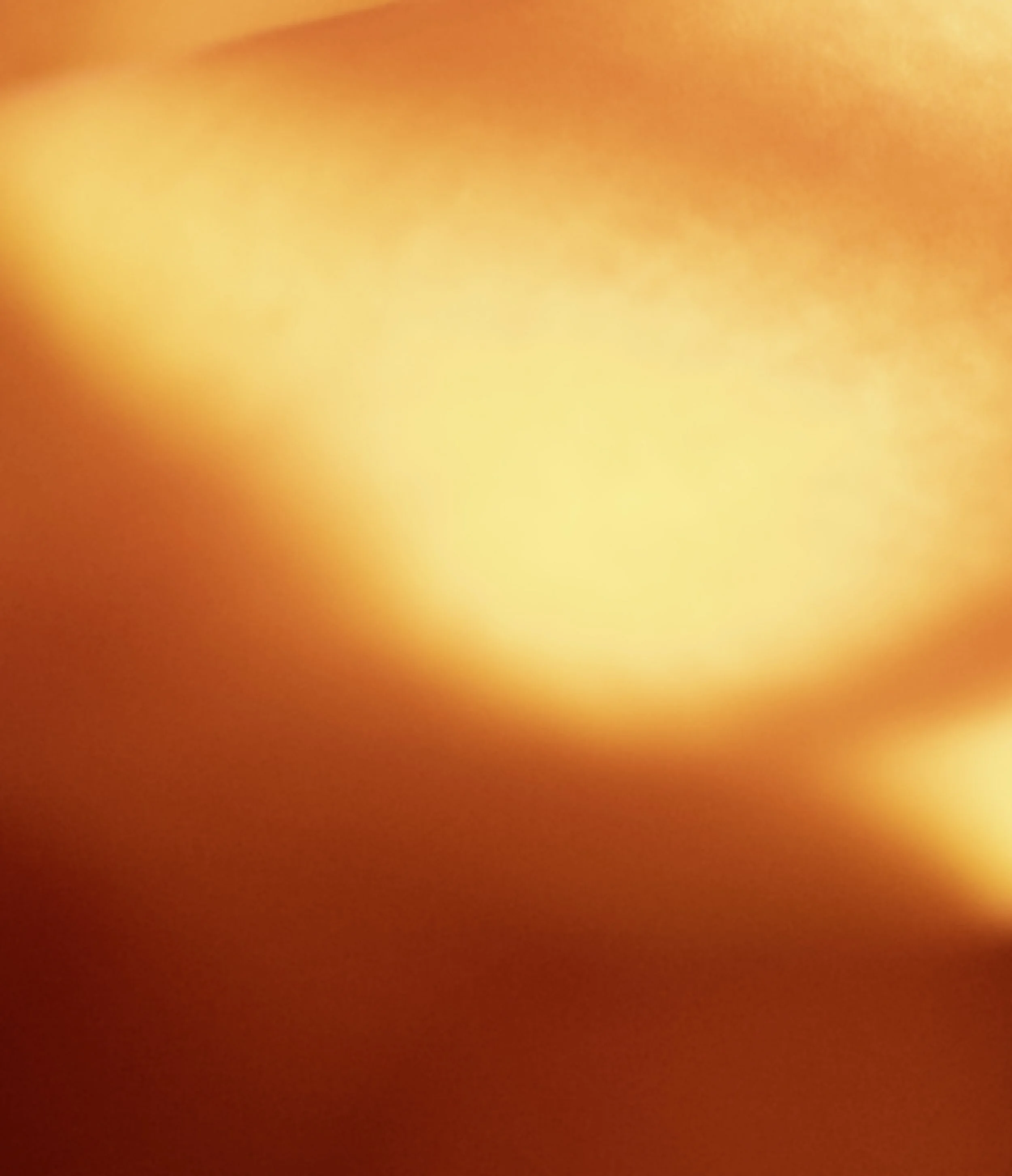
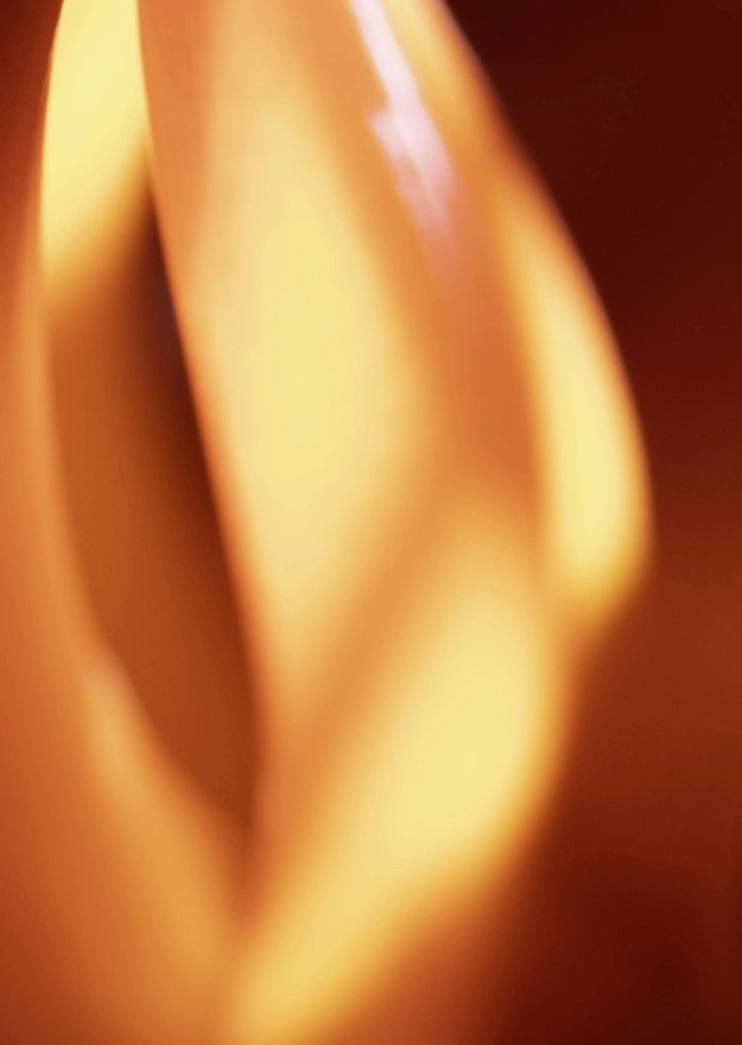
The colour series draws on abstraction and colour field theory, distilling flowers to their most essential chromatic elements. This series investigates the psychological and emotional impact of colour, emphasising the role of flowers in evoking memory, mood, and a sense of connection to the natural world.
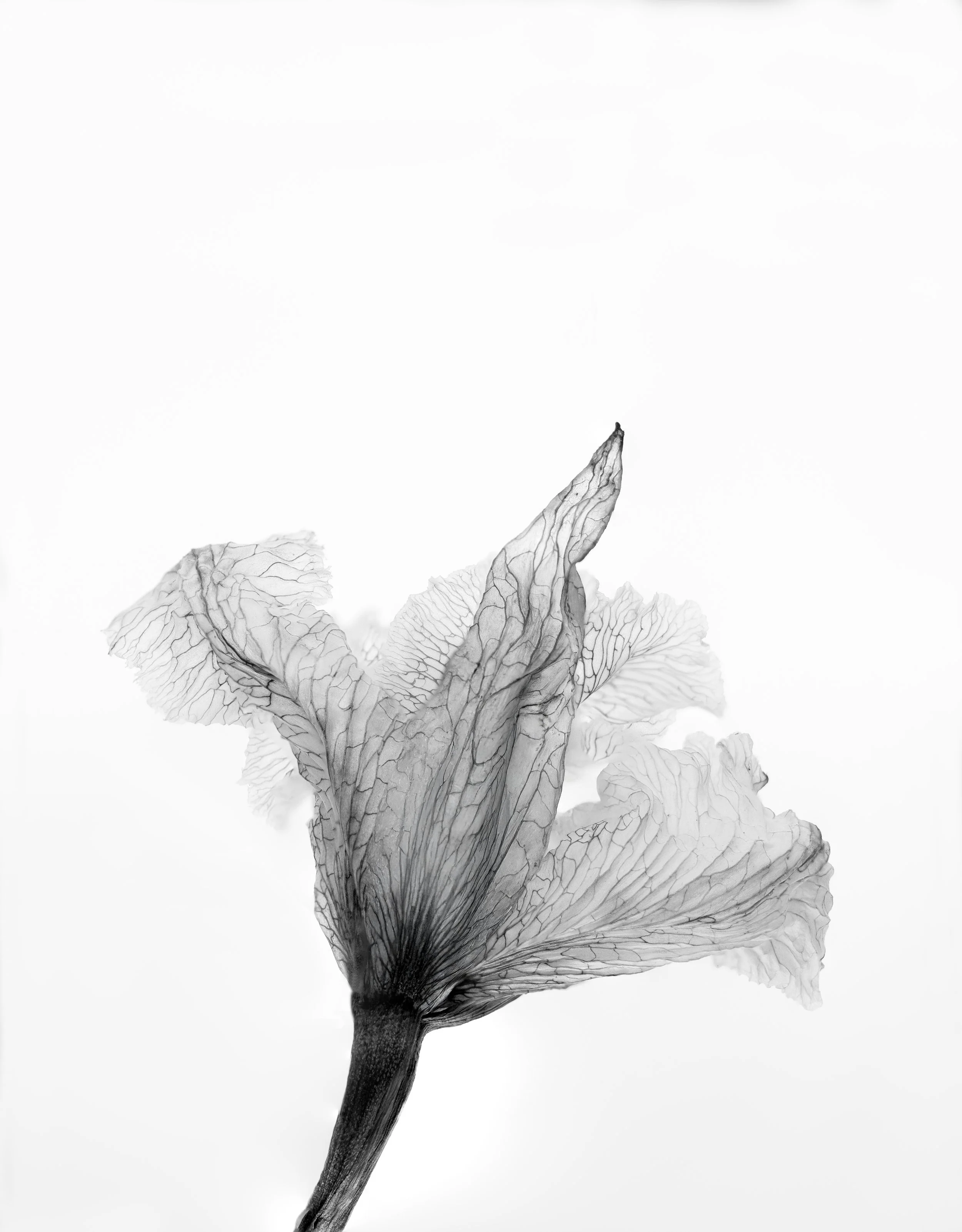
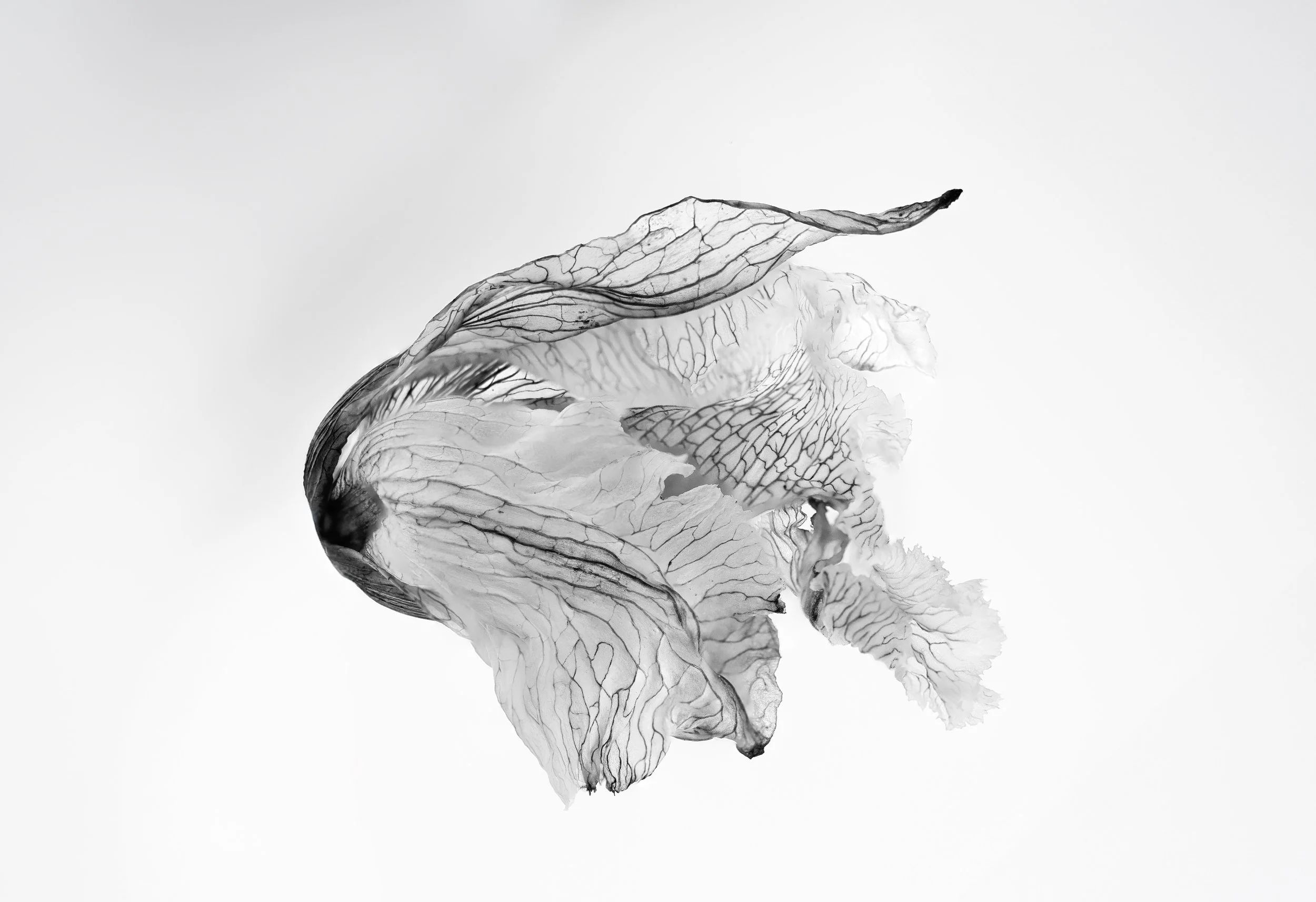
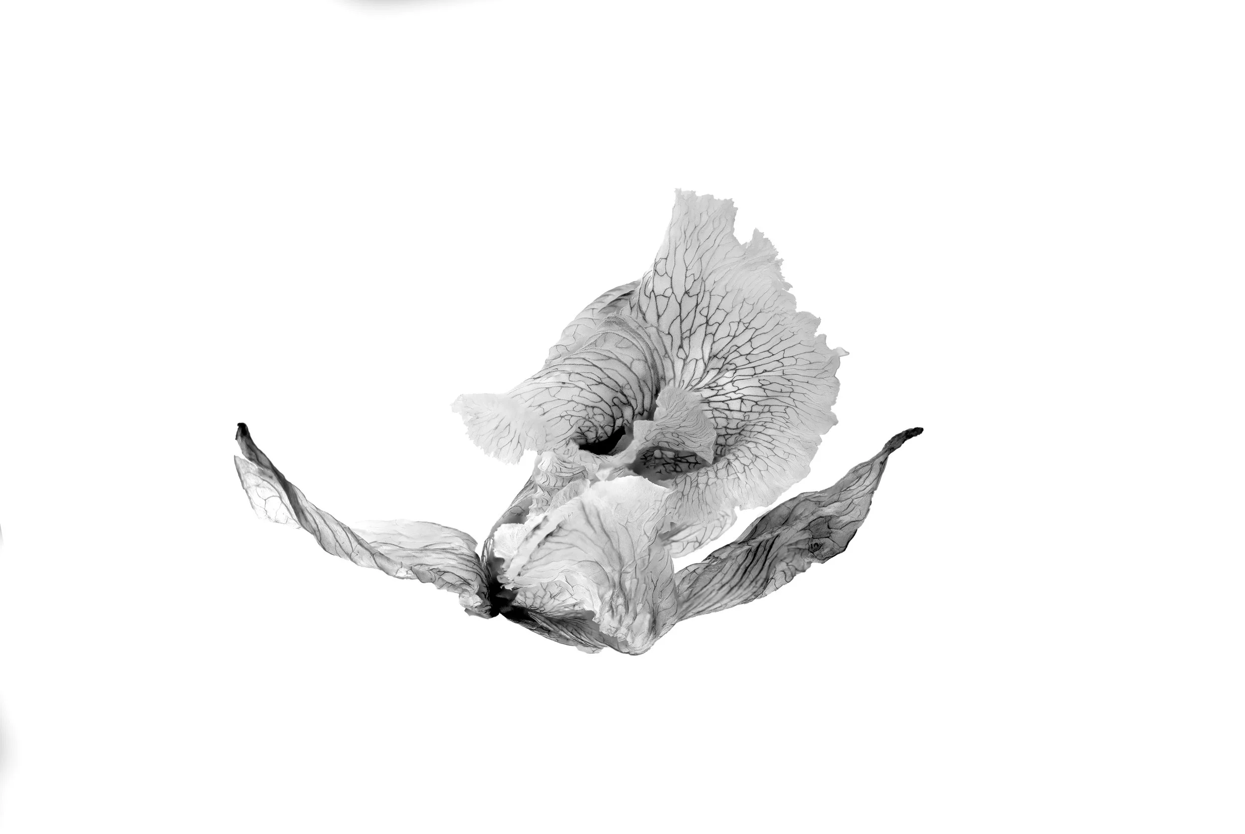
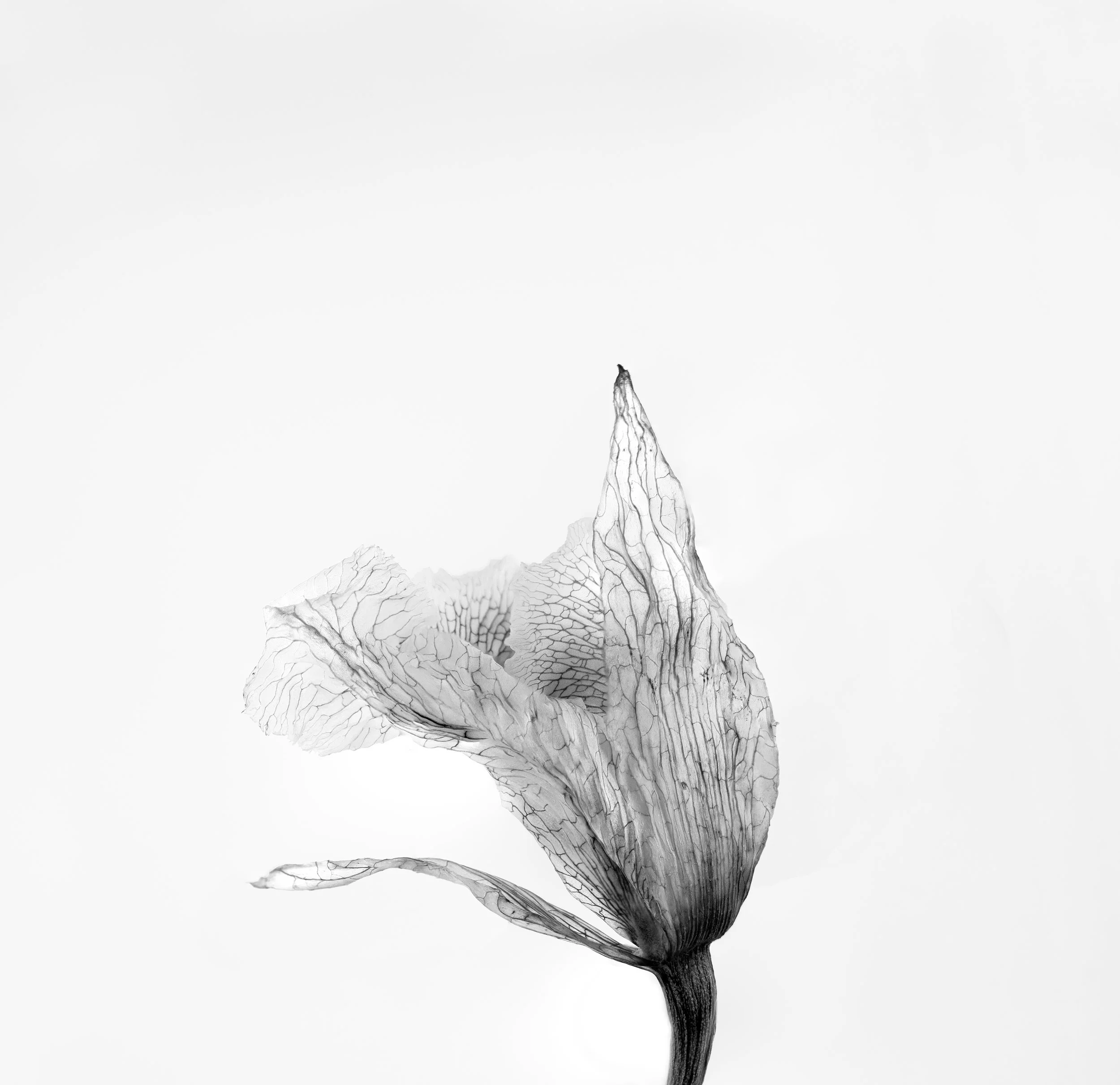
In contrast, structure removes colour, emphasising the structural essence of flowers. Through an intensified focus on form, texture and line, this series highlightslife’s delicate fragility and transient beauty. It reflects ephemeral yet resilient qualities of both nature and human existence, fostering a nuanced understanding of our relationship with the natural world
While the outcomes of the series differ, the deliberate simplification in each unveils the hidden intricacies of nature. My dual approach offers a deeper appreciation of botanical complexity, interconnectedness, and the properties of light which inform both colour and structure.
Flowers inhabit our memories, our rituals, and our language. We describe them as we do ourselves, with words that speak of life and emotion. Through this act of personaifcation, the boundaries between human and botanical perception dissolve, revealing their shared emotional and structural vocabularies.

In Lightbourne, the flower is abstracted to become a vessel for reflection. Macro photography expands what is minuscule, allowing the viewer to see what would otherwise remain unseen. Two visual languages have emerged - one which has colour removed to reveal the intricacy of forms, while the other releases structure to highlight colour and the emotions that this can evoke.
Though their methods diverge, both series speak to each other and reach towards the same truth: that strength and fragility coexist, and that emotion can be felt as vividly through absence as through abundance.
Within these oppositions - of detail and diffusion, structure and sensation - each botanical can become a mirror for the viewer’s own states of being. Each work invites pause, a moment to stand before it and appreciate the provocations that the work poses. What memories or moods stir?
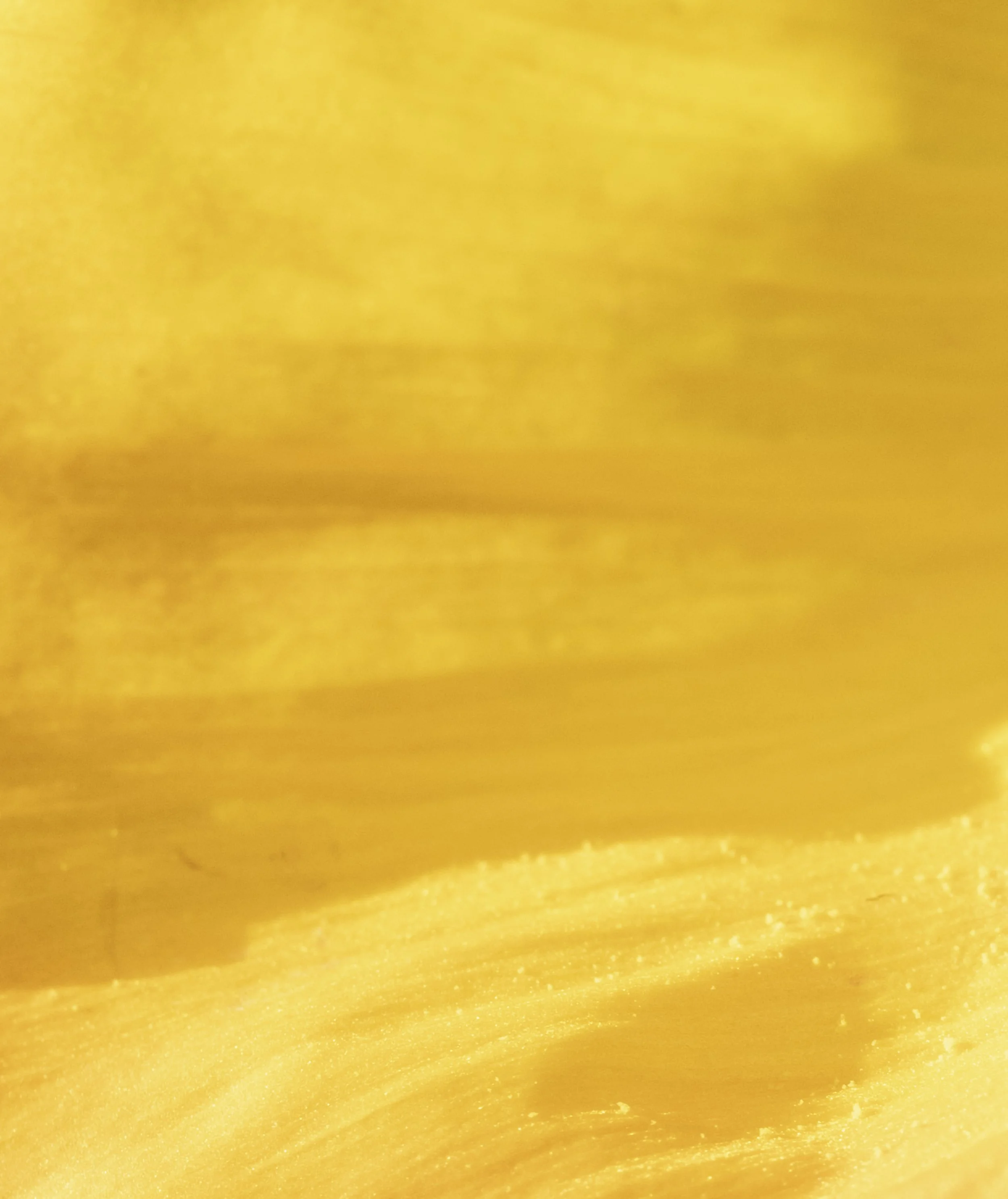
Through these encounters, colour, light, and natural form are revealed as being heavily intertwined. This quiet, revelatory space enables perception to become feeling.
Light here does not function to reveal form, but to unsettle it. The work establishes a psychological rather than representational space. Meaning remains open, formed through the viewer’s perceptual, emotional, and bodily engagement rather than symbolic interpretation.
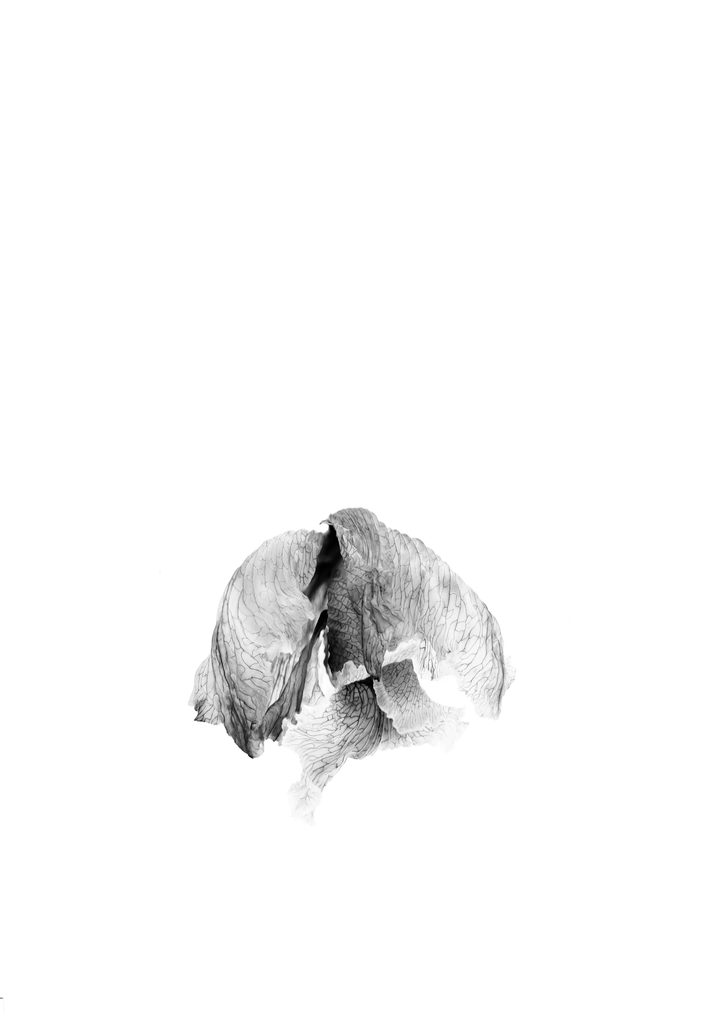
Although not part of the Lightbourne exhibition, this piece was made as part of the exhibition's experimentation. I was playing with negative space. Although I don't have a black border around the artwork to delineate the space, you can see here the flower is floating down, and does not occupy the centre, the middle or the top, but instead falls, enveloping downwards, beyond the middle of the frame.
This piece was Works on Paper at the 2025 Townsville Art Society Awards & Exhibition and was on display at Perc Tucker Regional Gallery from 13 Sept to 16 Nov.
To conclude, this exhibition has grown from many threads — observation, reflection, connection and of course my experience in Transitions, a program that gave me the space and guidance to expand how I think about my work, and the confidence to keep evolving it and to gain a greater understanding of the perception and reality of contemporary photography. And, of course, all the things you learn along the way from the mentors and mentees from different artistic backgrounds and practices, by being in the same room.
I’m grateful to my mentor, Dr. Ann Vardanega, who continues to guide and encourage me. Ann generously wrote the Foreword to the exhibition brochure.
Vicki K